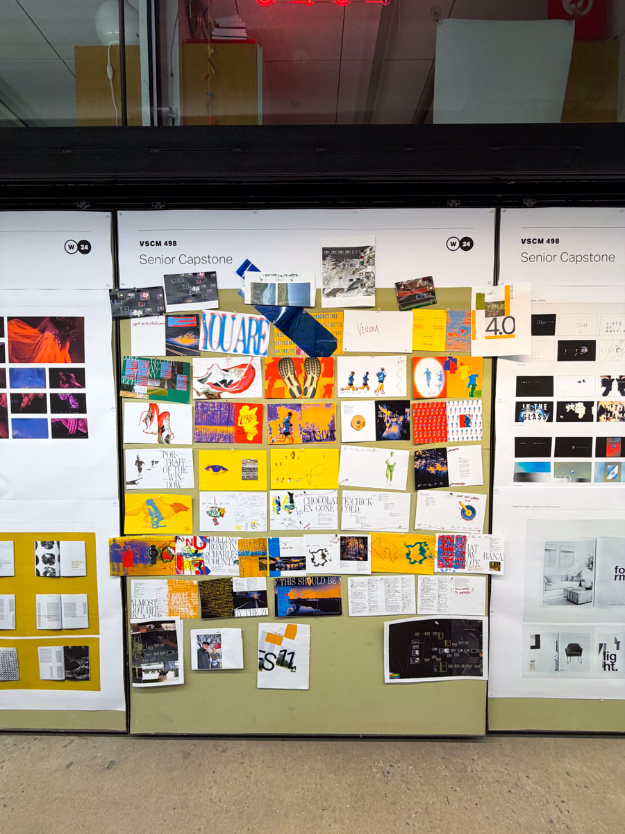
WITA WITA (What I think About When I think About...) running is my Senior Capstone at Drexel University. When I think about running, I can think about any number of things. Running has meant different things to me in my life: it has been something I did for fun, for more quesadillas, for solitude, for company, to punish myself, to wake up, to fall asleep, to think, to stop thinking, so I can look like Mick Jagger or feel like David Goggins or talk like Bob Dylan to myself. It has always been there, and it is always somewhere in the limbo of what I have complete constant control over and extraordinary vulnerability to. By that I mean, if your legs cease to move you will fall flat on your face and you will not keep moving. To me that has been a very natural way of existing because for as much intensity one needs to keep going, they are often completely unaware of that control.
Besides these few fundamentals, in my perception of running, running is only the visual muse to say what I need to say, how I need to say it. That said, this project is equally as simple as it is intangible, which was a difficult balance to perform because I am not trying to talk like I know everything. I only know what I know, but there are still things I want to say about what I perceive.
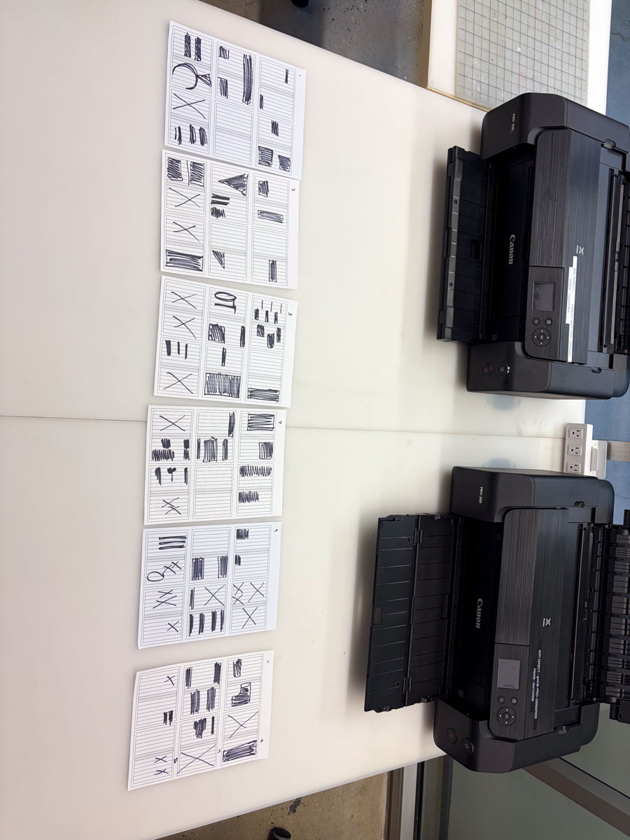
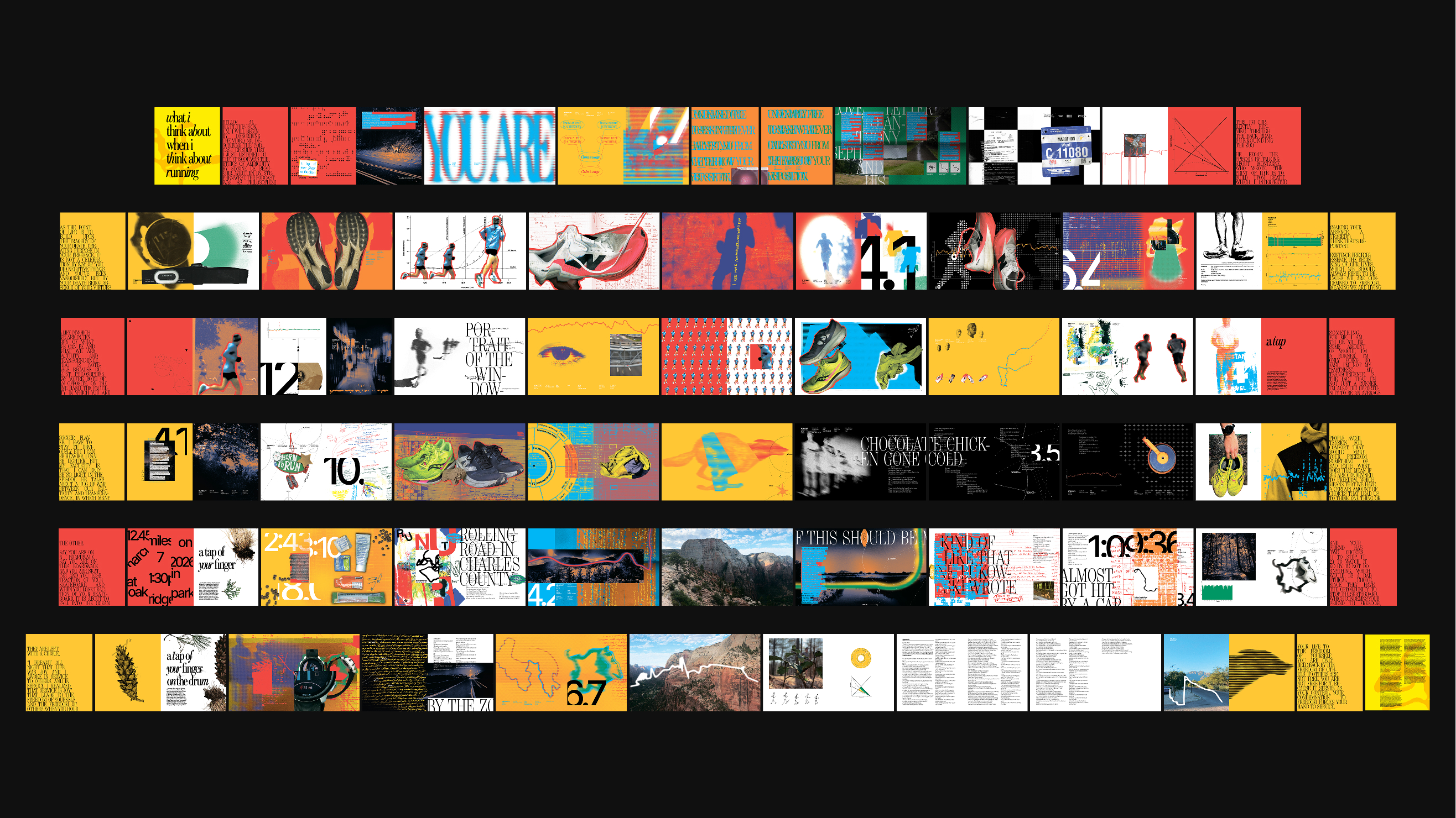
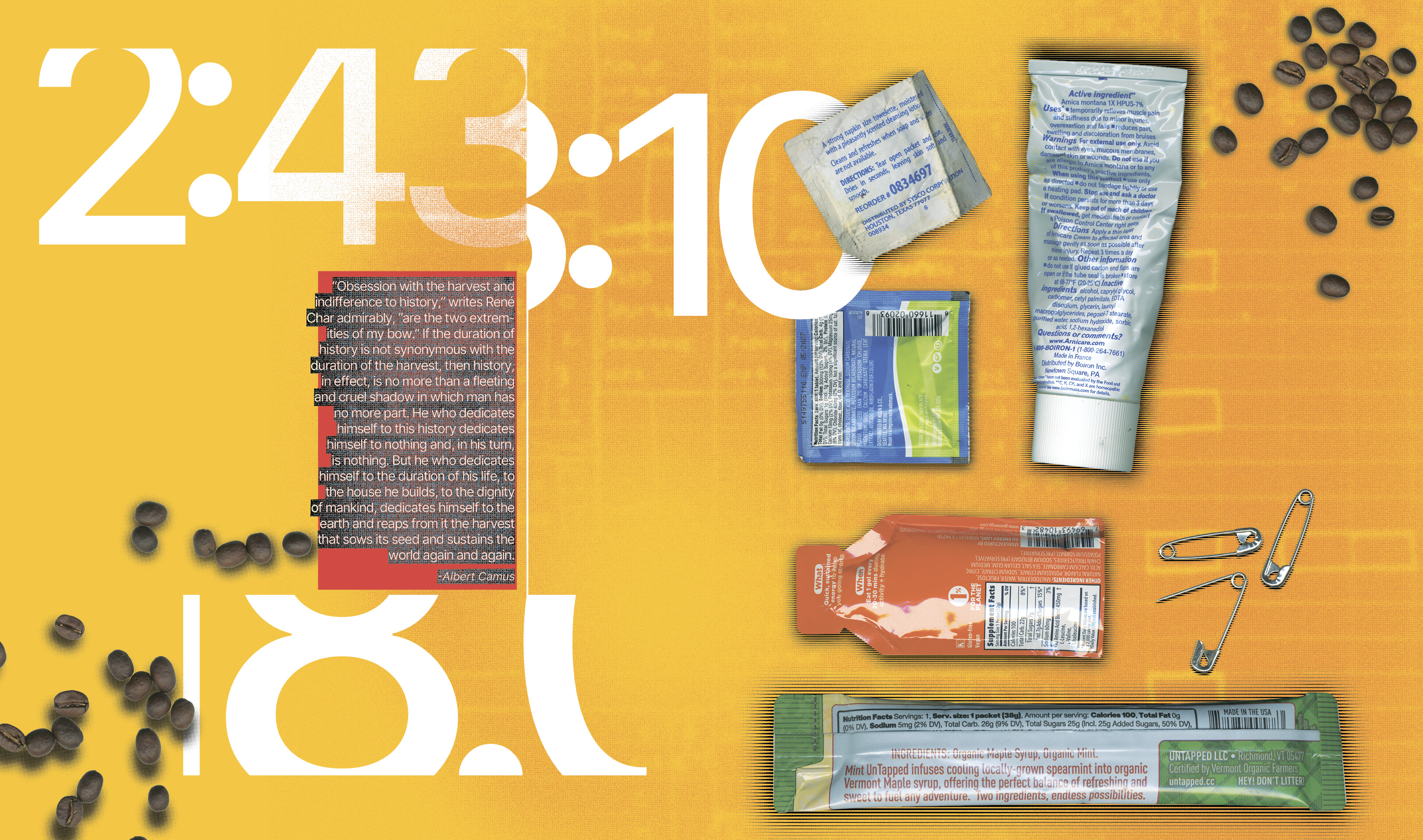
Touching on metric vs. perceptual graphics, I wanted to describe this dualism of running by creating a tension between languages in the book. On one hand, the system and typography use four rows to index the intensity of a run, with the type of run, and pace it by the general layout of a week. That can be best described by a monday– sunday translation of off-workout-easy-easy or medium long - workout - easy - long, and all of my pacing built from that starting point. My system also introduces serif font to describe feeling, and sans-serif font to describe fact. Where there are builds of numbers, strategies, and sometimes repetition of a poem, there is truth in what is logged or strived for. Otherwise, there is an input with running that is vulnerable to whichever way the wind blows, and determines whether or not inspiration strikes, or I think about a bunch of nothing.
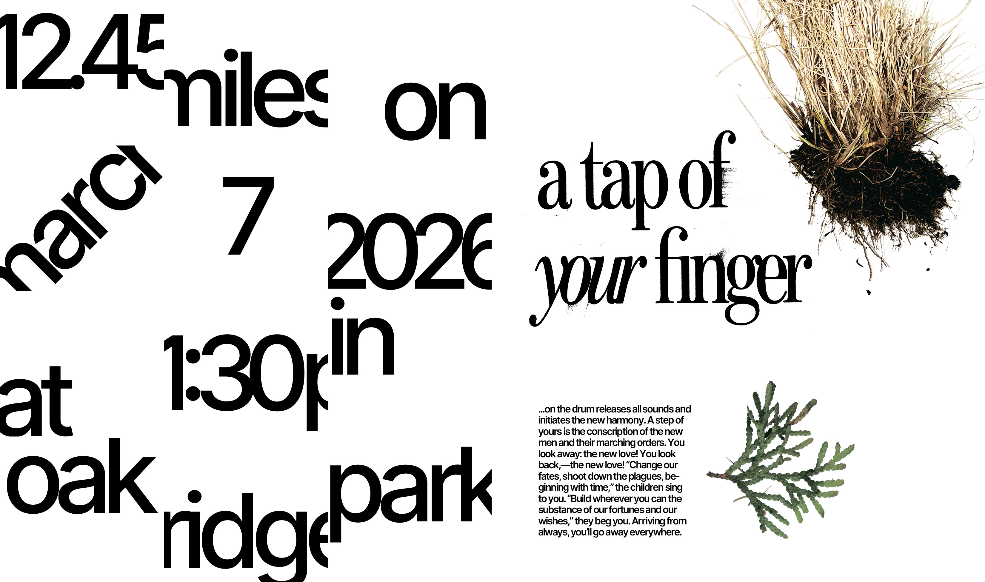
This is a very process-driven project. My intentions towards the design solutions are equally as important as the interpretation an individual brings to a spread. Where there are instances that I hid text out of embarrassment, left visual holes when a reader would expect information, or imagery that is seemingly unrelated, there is an intention as a designer to show authenticity on how it can feel to be an open book or the blurriness of hindsight.
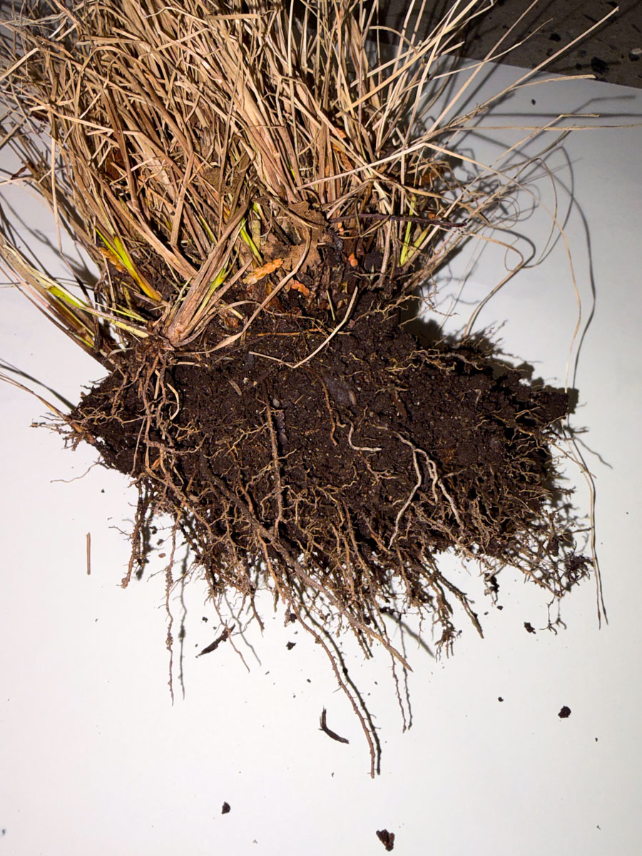
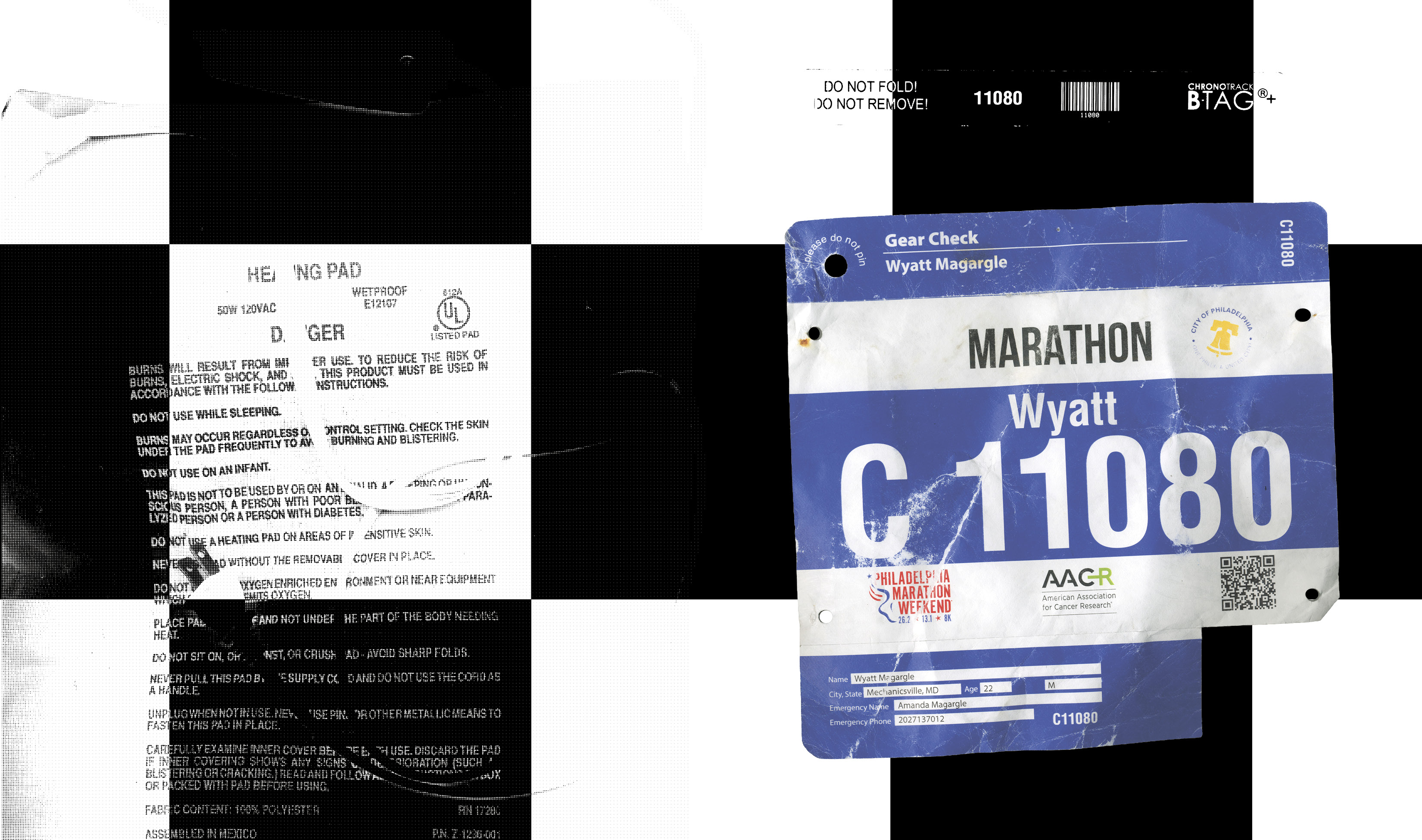
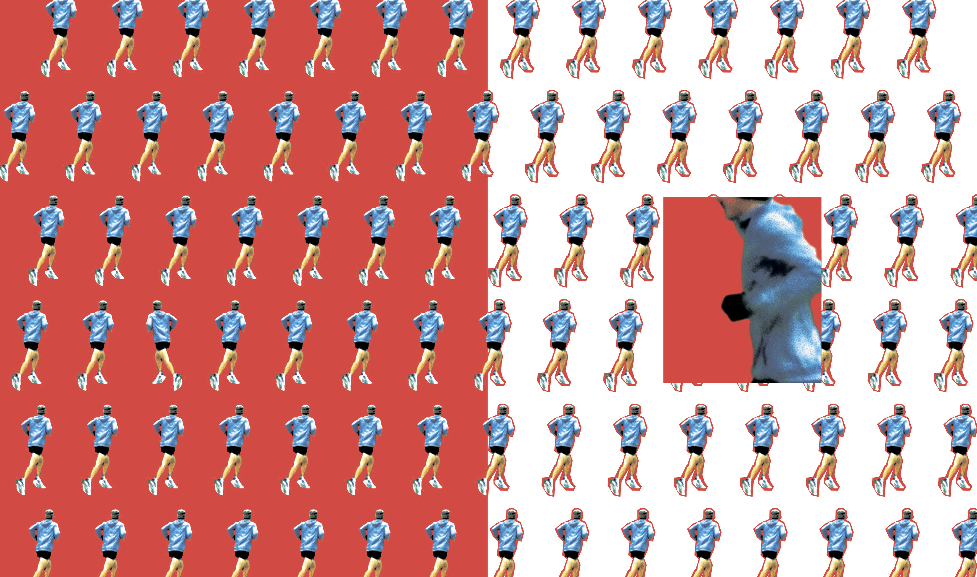
Similarly, I introduced a imagery in 3 ways; I introduced imagery that is random, spontaneous, and meaningless to me symbolically, however, having formal qualities that are consistent with my visuals to put myself in the position of the viewer; I introduced imagery that is entirely meaningful to me but meaningless to the viewer to leave the viewer the opportunity to self-interpret how the connections form between assets; and I introduced imagery that is meaningful to me but processed in such a way that abstracts its meaning, focusing on the formal qualities of the system.